Happy My Tour brand system
Brand story, voice, logo system and a 38-page guidelines book for a travel booking platform that recommends trips with AI.
The brief.
Happy My Tour is a travel booking platform. In its own words, it was “born from a simple belief” that planning a trip should spark joy, not stress. It says it offers more than 500 customisable travel packages, that its AI recommender suggests a trip after three questions, and that its support runs from discovery to after-sales.
Its stated mission is to simplify travel planning through intelligent recommendations, tailored packages and support. Its vision is to be the most trusted AI-powered travel planning platform, where booking a trip takes minutes. Its website, happymytour.com, has an “AI Search” box.
It needed a single brand for everything it puts out, from the website and social channels to print. Legit set that brand out in a guidelines book, “Customer Brand Visual Identity”, with six chapters: brand story, voice and tone, core brand assets, brand colours, photography and brand applications.
What we did.
- 01Brand story & voiceA brand story, a mission and vision, and voice rules that stay reassuring while travellers compare options and turn direct once they’re ready to book. The book describes the voice as clear, warm and confident, and sets out three pairs: empowering and assured but not passive, clear and actionable but not confusing, approachable and supportive but not cold. Each pair comes with examples marked “keep pushing”, “just right” and “we never say”.
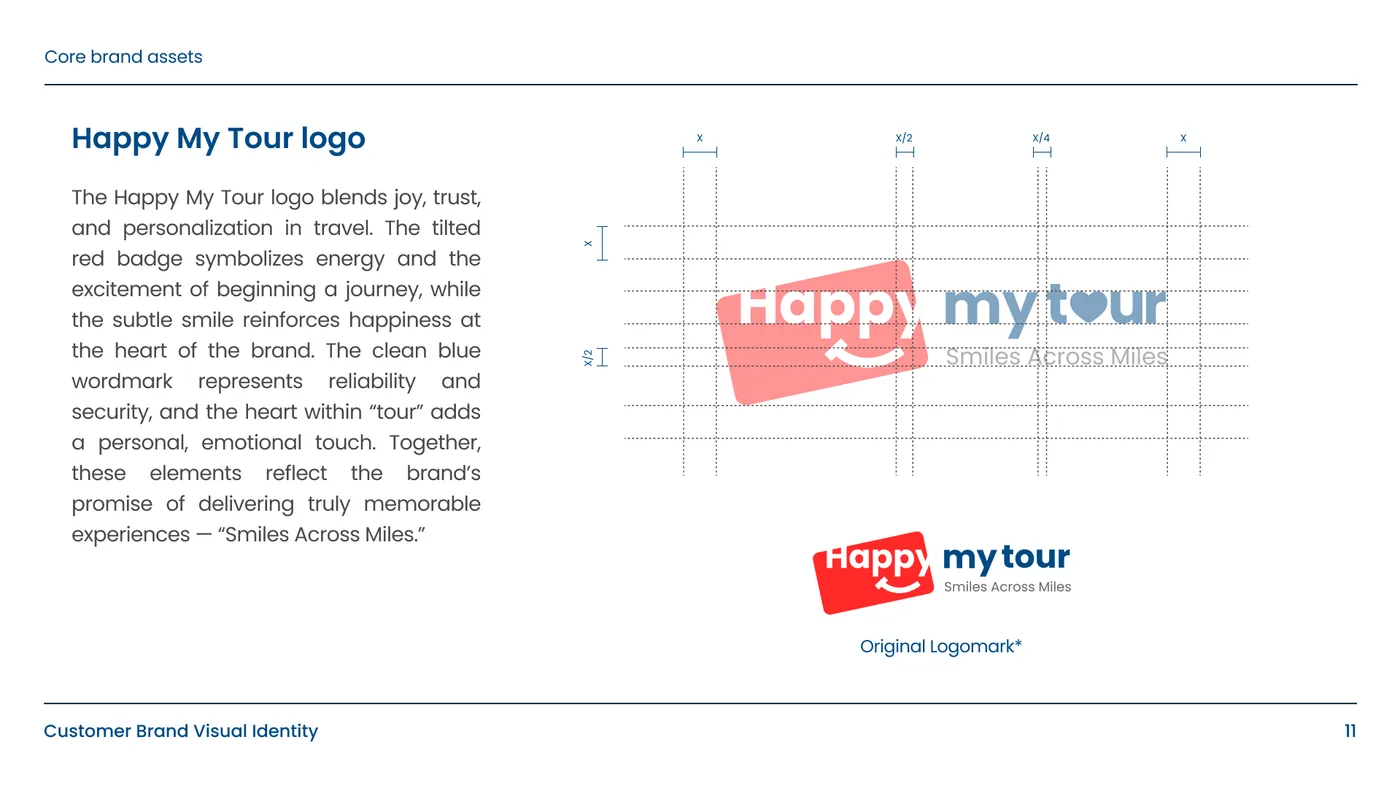
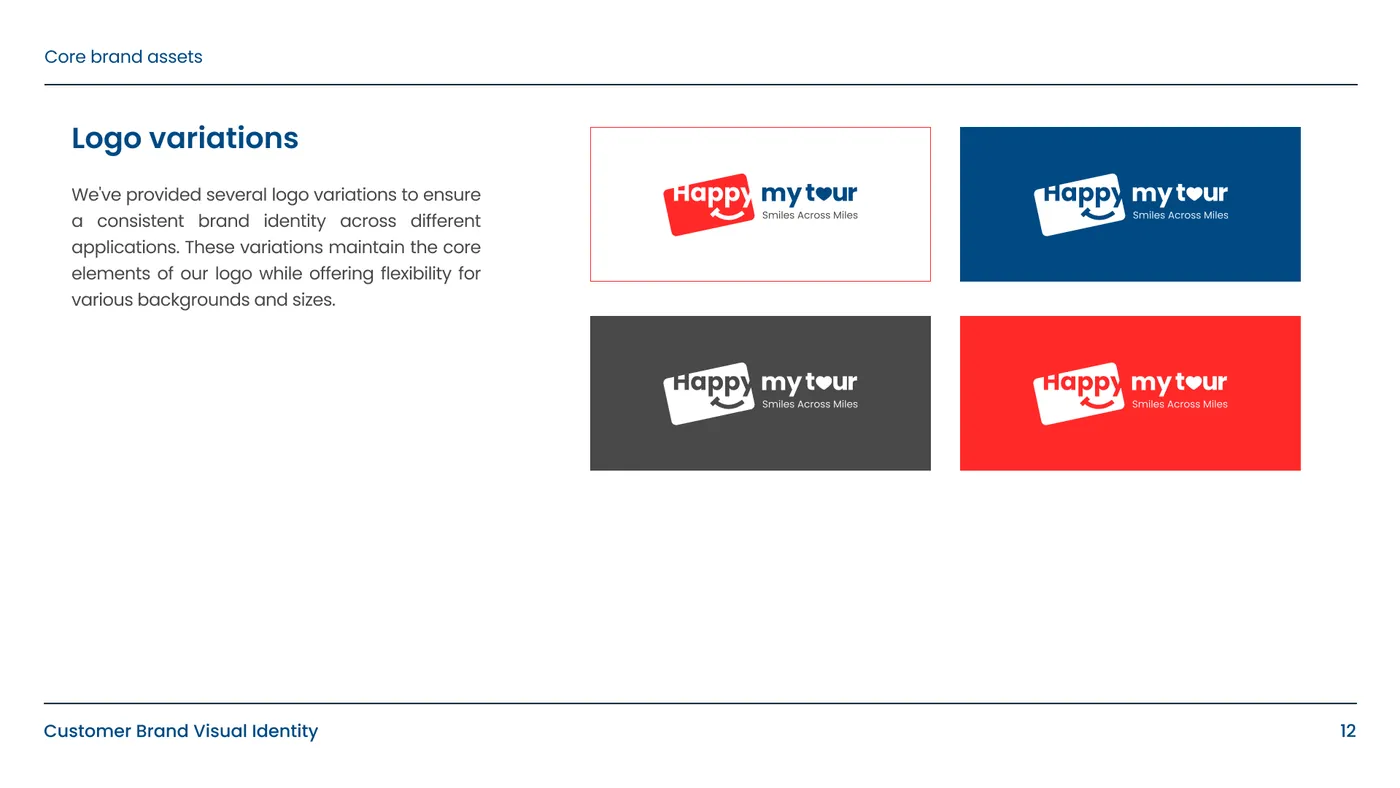
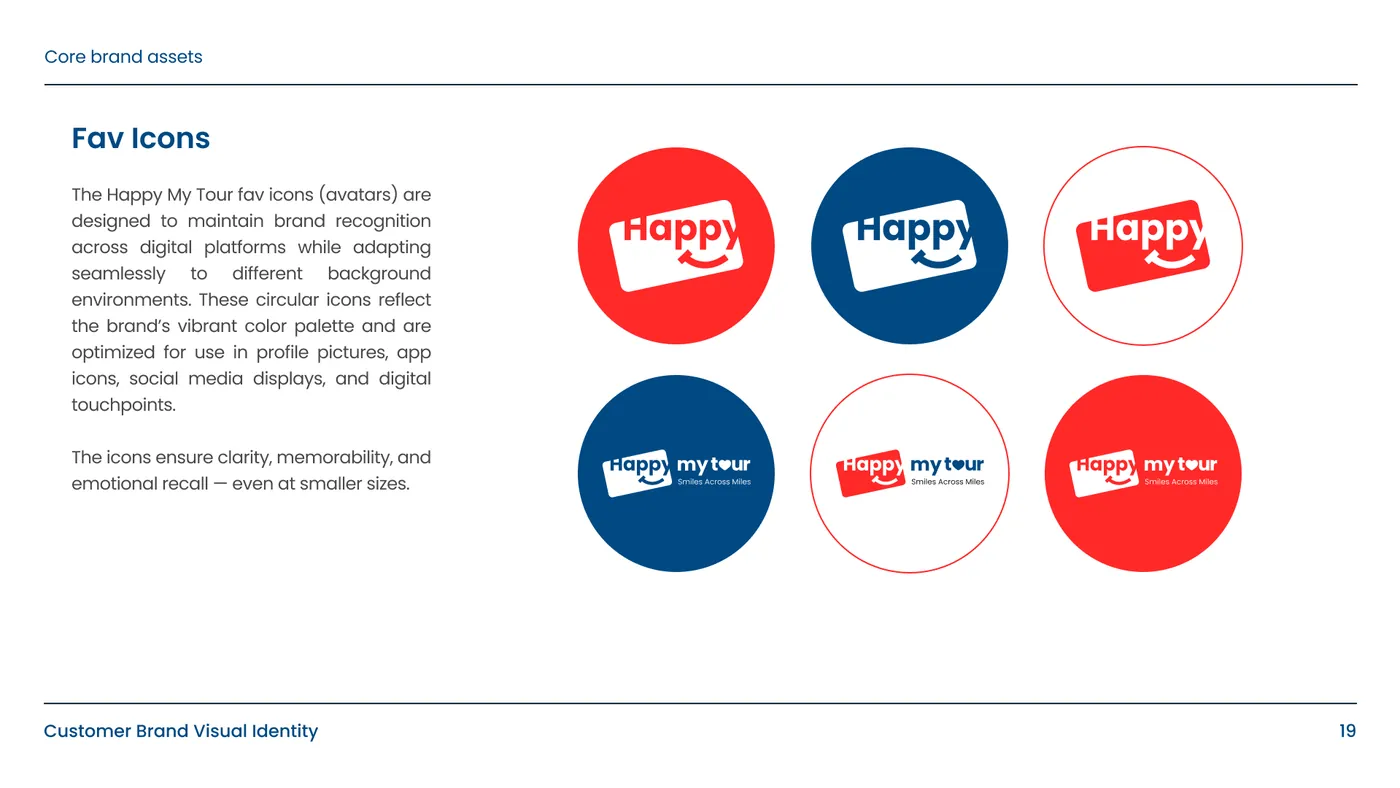
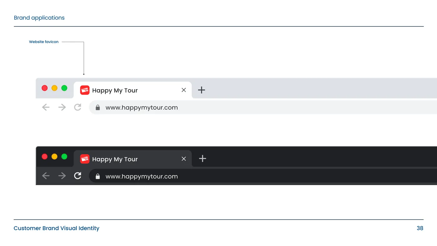
- 02Logo systemA tilted red badge with a smile, a blue wordmark with a heart inside “tour” and the line “Smiles Across Miles”, with colourways, minimum sizes, placement rules and favicons. In the book, the badge stands for the excitement of beginning a journey, the smile for happiness, the blue wordmark for reliability and security, and the heart for a personal, emotional touch. Placement rules cover landscape, landscape-wide, portrait and square layouts, and a page of don’ts forbids stretching, recolouring or distorting the logo.
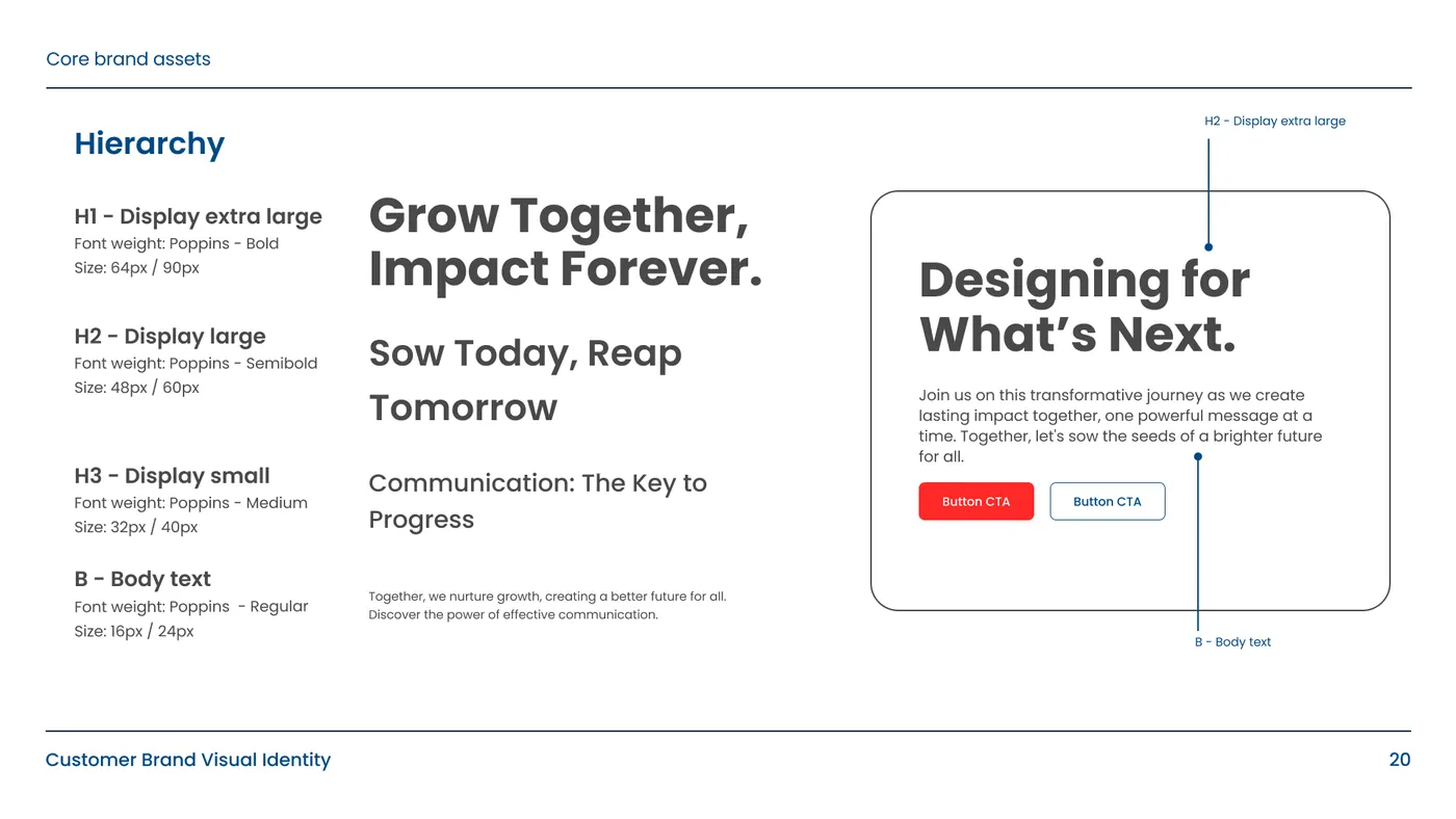
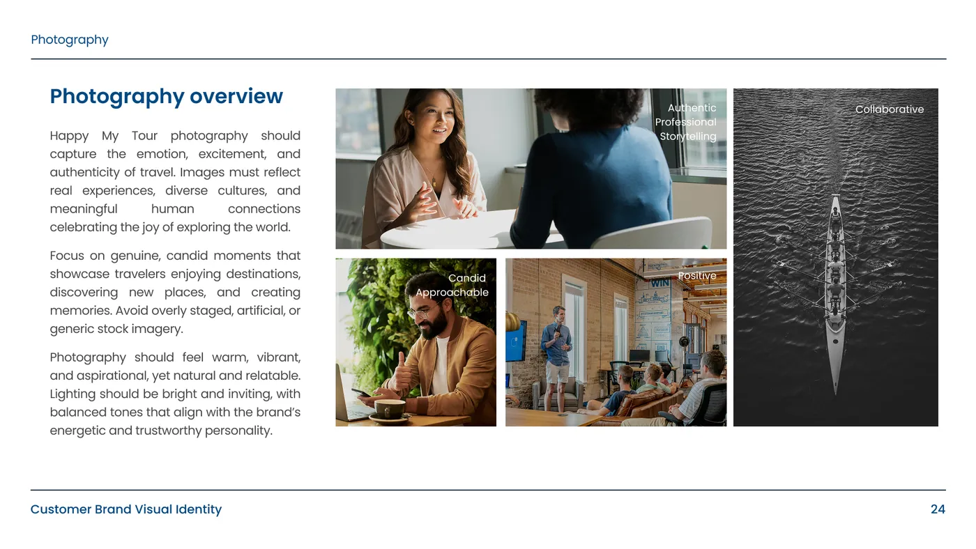
- 03Type, colour & photographyPoppins with a fixed type hierarchy, a red, blue and charcoal palette, and a brief for candid travel photography and avatars. White completes the palette, and Poppins runs from Light to Extra Bold. The photography brief asks for warm, natural light and real travel moments, never staged or generic stock images.
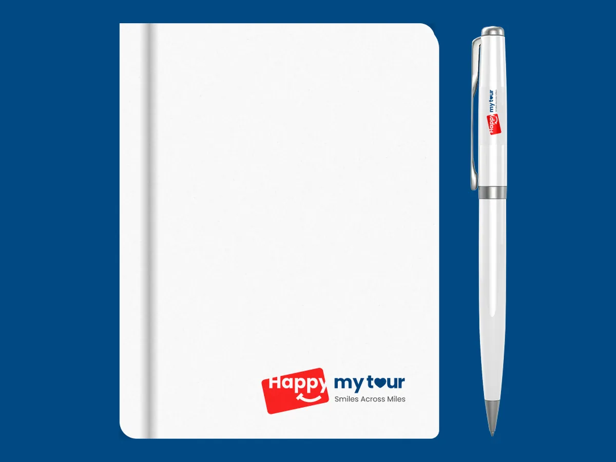
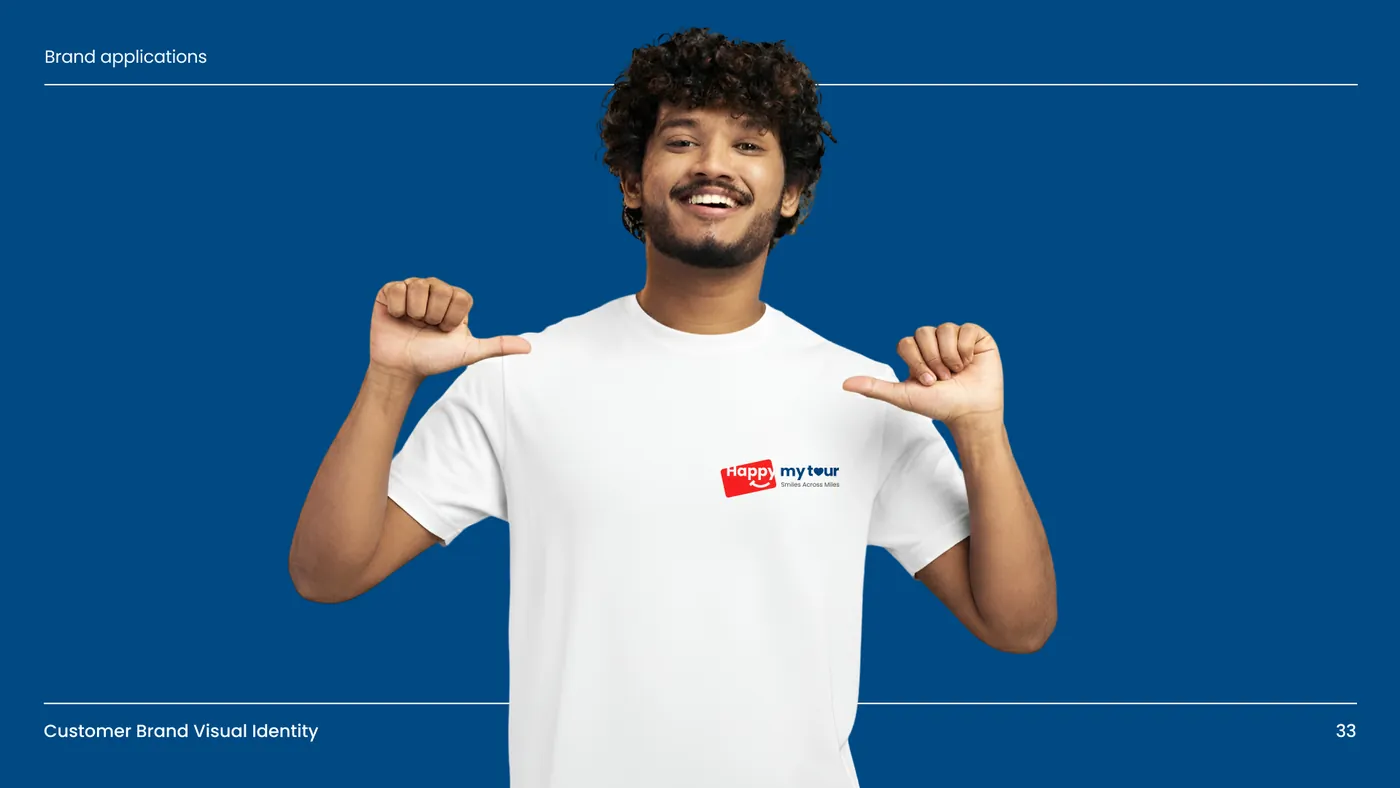
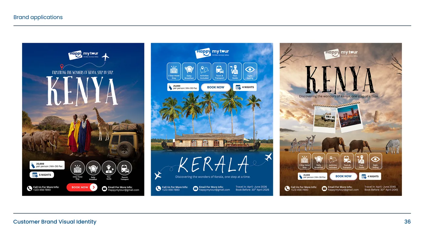
- 04ApplicationsLetterhead, business cards, ID cards, a notebook and pen, T-shirts, destination posters, a social profile and the browser tab, all built from the guidelines. Happy My Tour’s own website uses the tilted badge logo and the red and blue palette.
Legit wrote our brand story and voice, drew the logo system and put it all in a 38-page guidelines book. Our website, social posts, print and team now apply one brand the same way.

The work.
Want a brand like this?
Branding service →More case studies.
Read: How much does branding cost in India? →
Sabio Sphere Studios identity
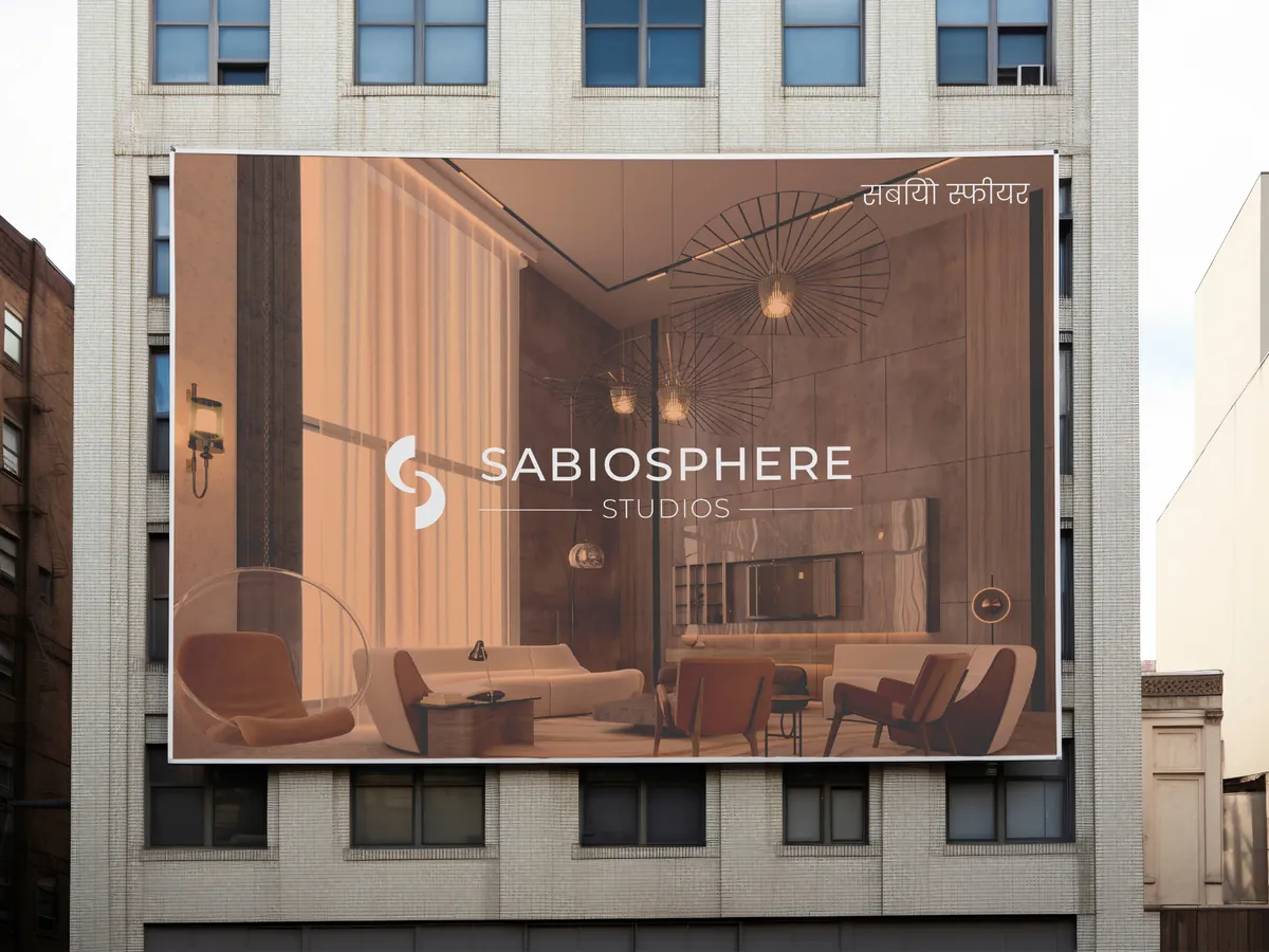
A monogram, wordmark and stationery for an architecture and interiors practice, from business cards to billboard artwork.
The Indian Voyage brand identity
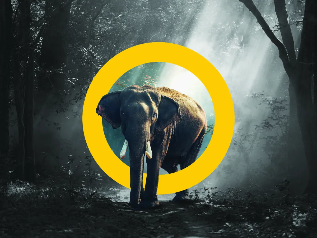
A wildlife-led identity for a tour operator, built on a yellow ring that frames tigers, elephants and peacocks on posters, merch and a jeep.
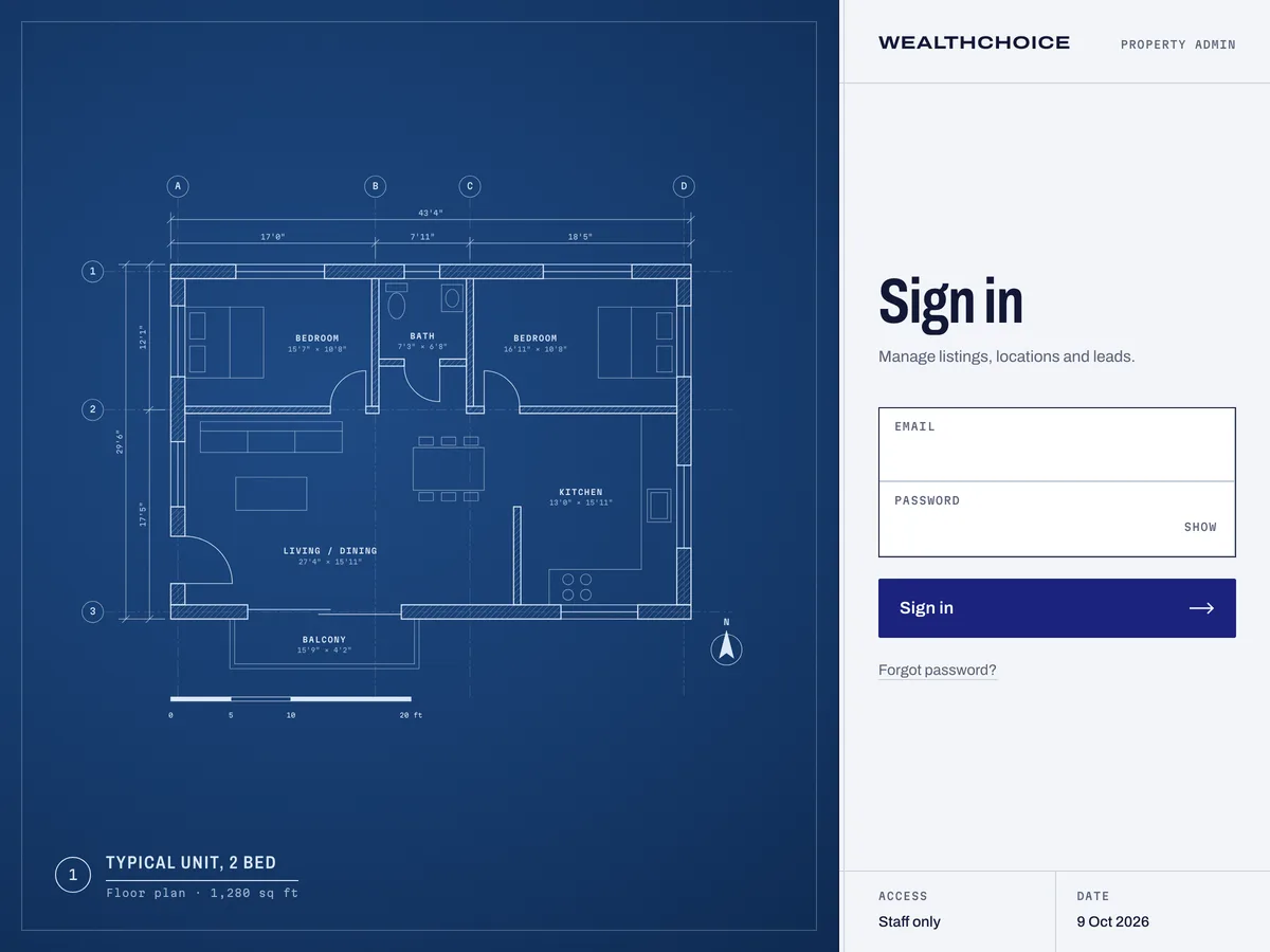
WealthChoice admin and API
One Nuxt 4 app to replace WealthChoice’s Express API and React admin, with a redesigned admin and one API for its India and Dubai sites.
Tell us where you want to grow.
Share a few details and we’ll come back with an honest view of what to do first, whether or not we’re the right fit.
Brief received.
Thanks. A strategist will reply within one business day.