
Sabio Sphere Studios identity
A monogram, wordmark and stationery for an architecture and interiors practice, from business cards to billboard artwork.
The brief.
Sabio Sphere Studios is an architecture and interiors practice. It needed a complete identity: a mark, a wordmark, colours and the printed pieces the studio uses every day.
Those pieces run from a business card to billboard artwork. The mark and wordmark had to sit on white paper, on deep indigo card and over an image of a furnished interior.
What we did.
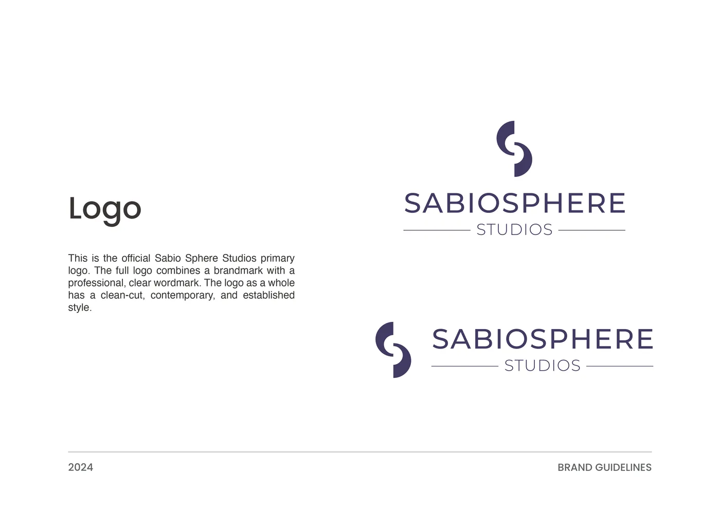
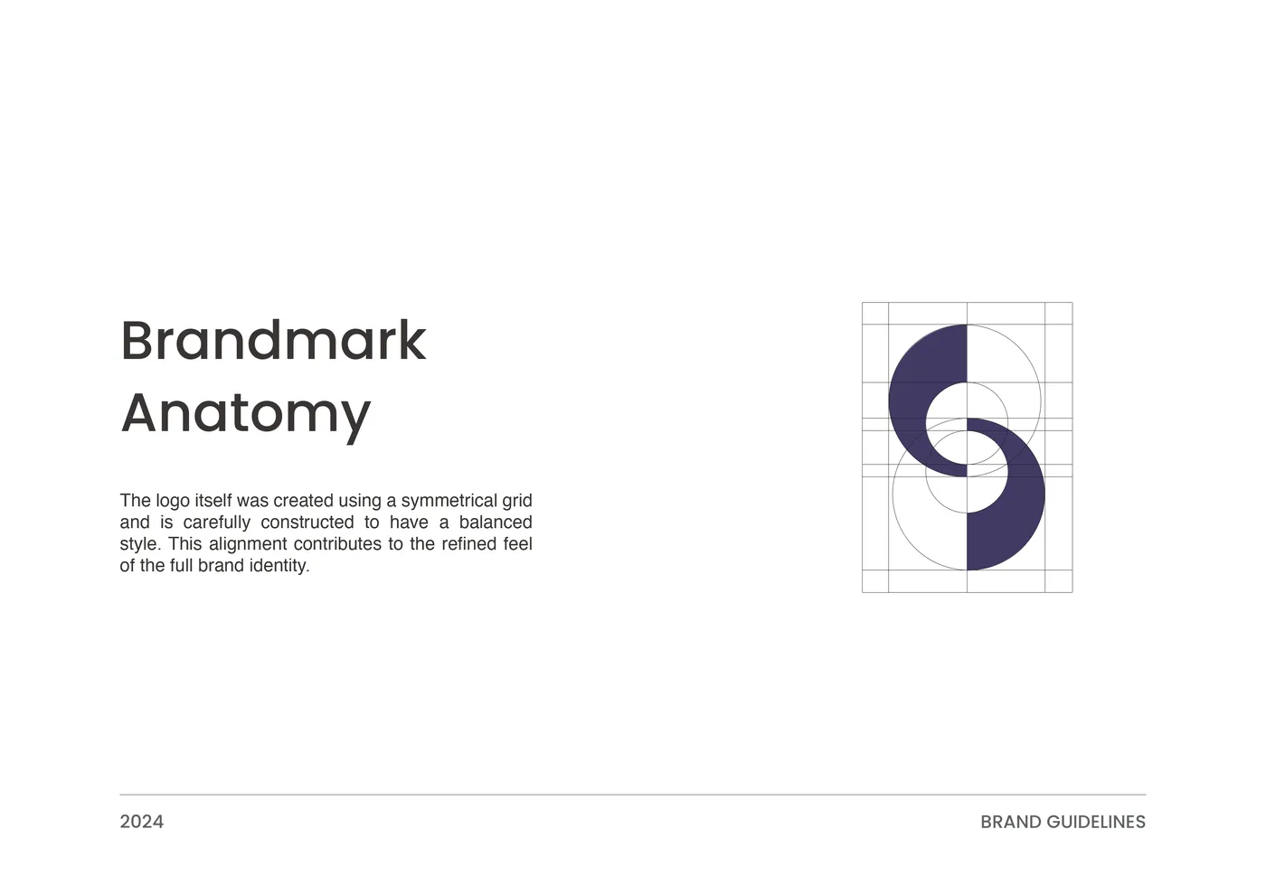
- 01MonogramTwo S letters joined into one mark on a symmetrical grid, built so it reads the same upside down.
- 02Wordmark & colourA clean wordmark with “Studios” set between two rules, in deep indigo with a peach accent. The name is set in capitals, with “SABIOSPHERE” as one word and “STUDIOS” smaller and lighter beneath it. The two rules run out to the full width of the line above.
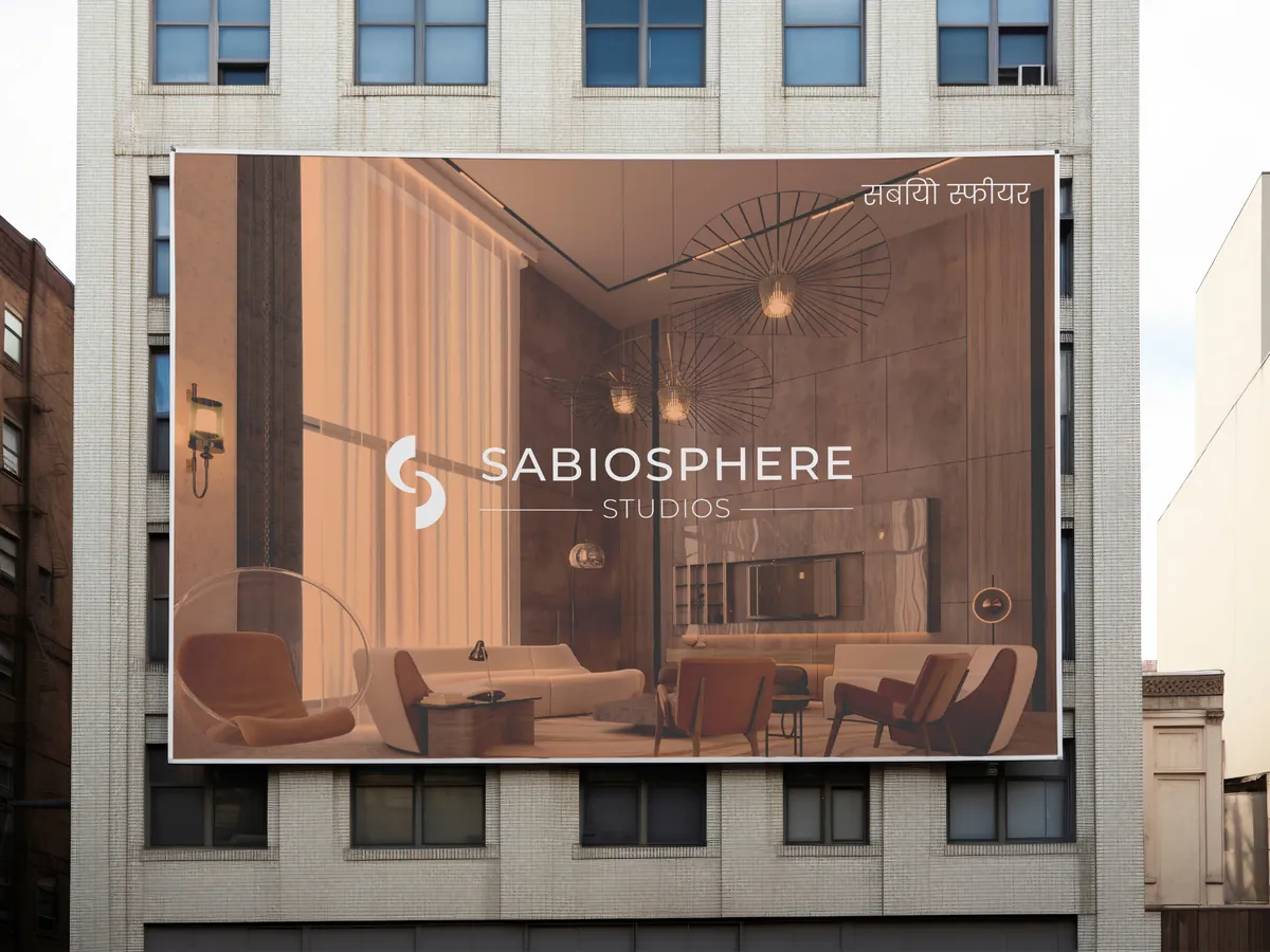
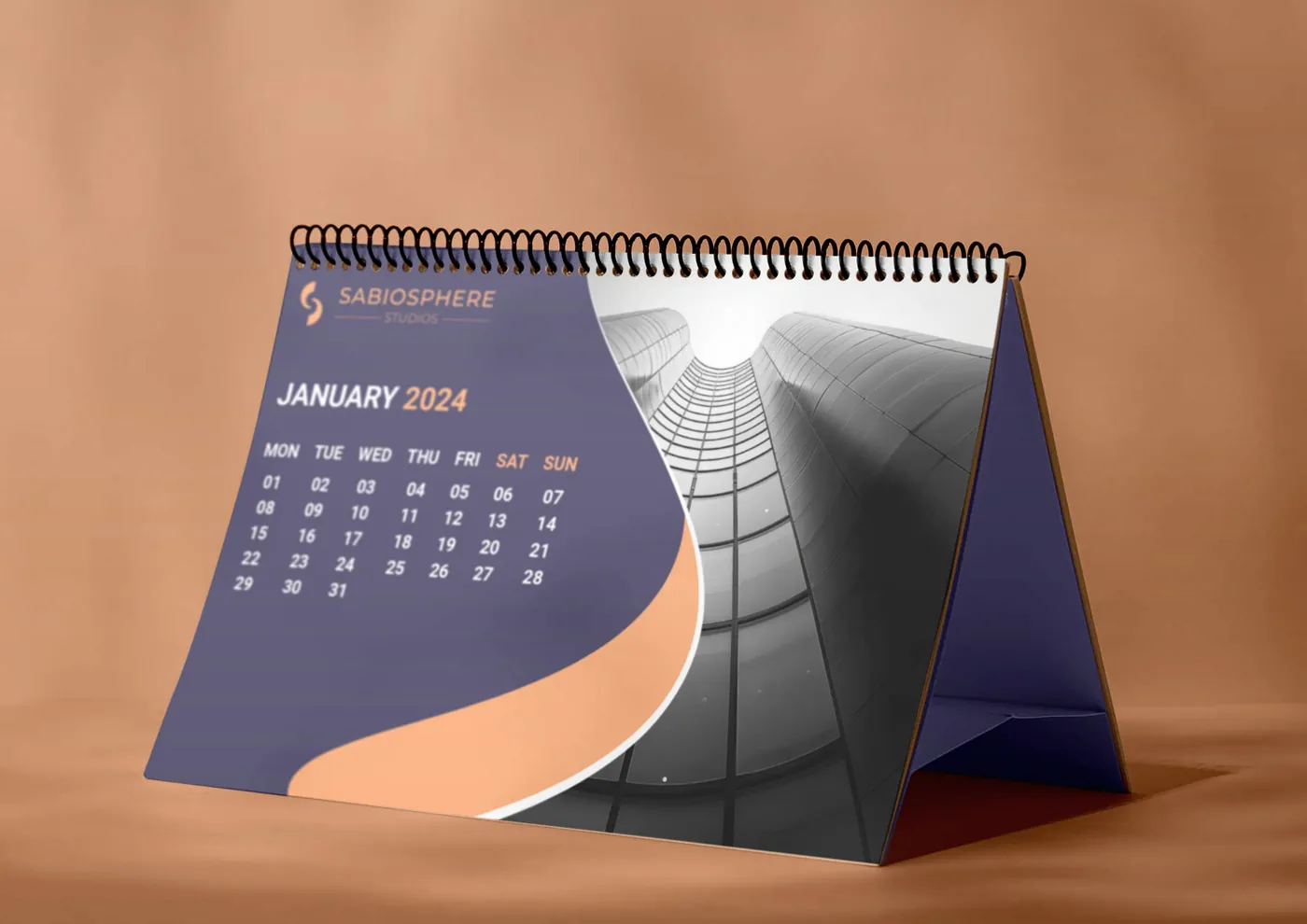
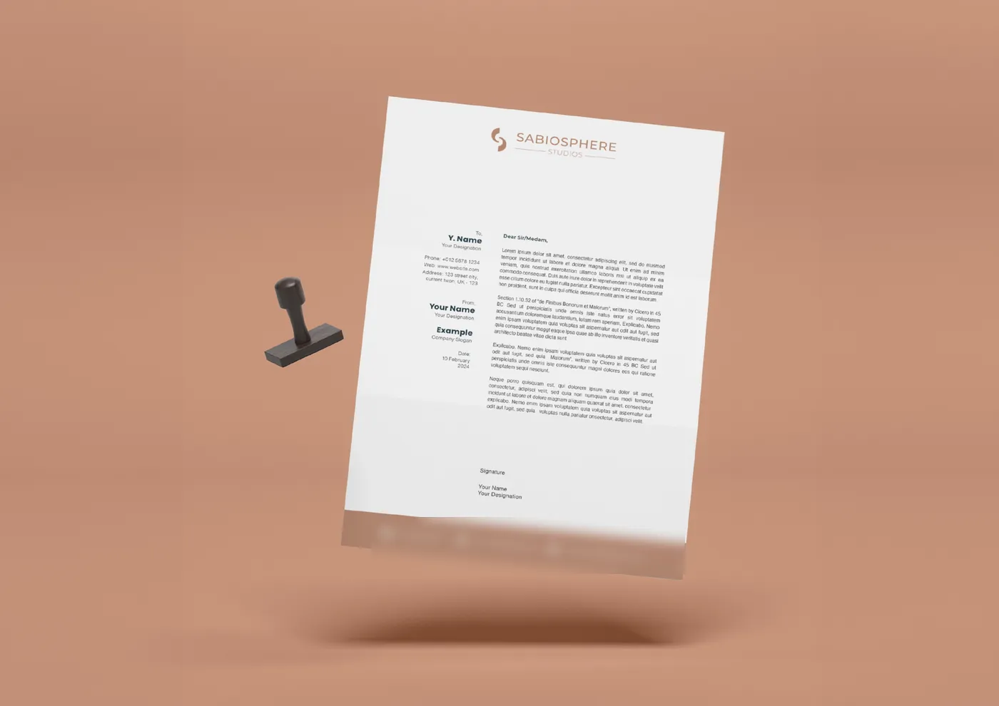
- 03Print & signageLetterhead, business cards, a desk calendar and billboard artwork in the same indigo and peach, with the letterhead kept mostly white. On the billboard artwork the logo is reversed out in white over the interior image, with the studio’s name in Devanagari in the top right corner.
Legit designed our complete identity: a monogram of two joined S letters, a wordmark in deep indigo and peach, and the letterhead, business cards, desk calendar and billboard artwork we use every day.

The work.

Want a brand like this?
Branding service →More case studies.
Read: How much does branding cost in India? →

The Indian Voyage brand identity
A wildlife-led identity for a tour operator, built on a yellow ring that frames tigers, elephants and peacocks on posters, merch and a jeep.
WealthChoice admin and API
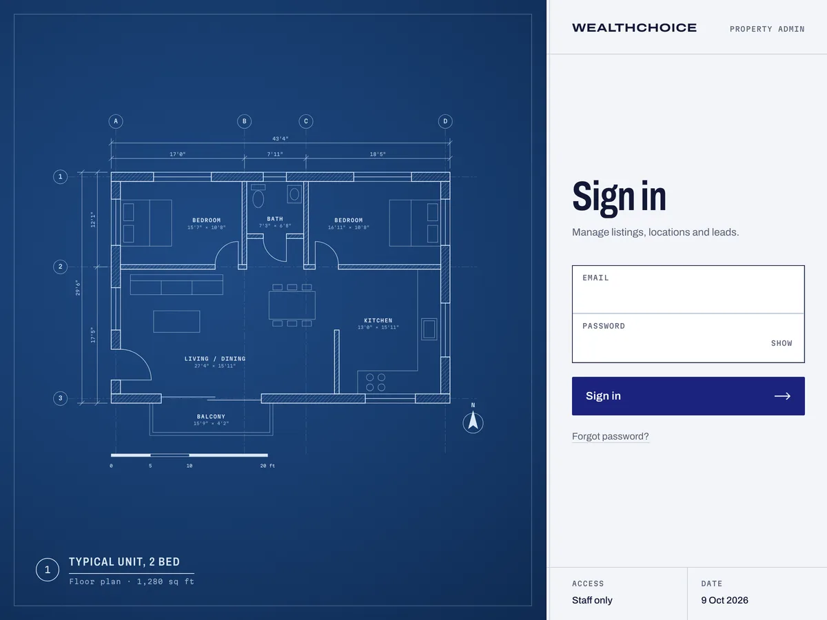
One Nuxt 4 app to replace WealthChoice’s Express API and React admin, with a redesigned admin and one API for its India and Dubai sites.
Happy My Tour brand system
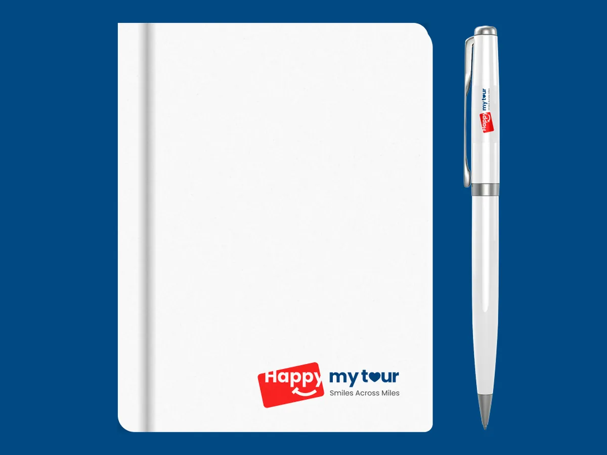
Brand story, voice, logo system and a 38-page guidelines book for a travel booking platform that recommends trips with AI.
Tell us where you want to grow.
Share a few details and we’ll come back with an honest view of what to do first, whether or not we’re the right fit.
Brief received.
Thanks. A strategist will reply within one business day.